Scuttle:
A Case Study in Mobile Application UX Research and Design.
The daily commute by bus can be a source of frustration and inconvenience, from missing the bus, waiting for delayed buses, or boarding the wrong one. Scuttle is an effective solution to simplify the challenges of commuting by bus.
Overview
Roles & Responsibilities:
UX Designer —
User Research
Research Analysis
Product Strategy
User Flows
Interaction Design
Low- and Mid-Fidelity Prototyping
User Testing
Tools: Figma, Google survey/analytics
Duration: 1 month
Team: Self-directed with feedback from mentors and peers
The Challenge
To develop an app that will serve a city in the American midwest
Primary functions include: access to estimate bus arrival times for all bus routes and stops & real-time tracking of buses approaching chosen stop
The Solution
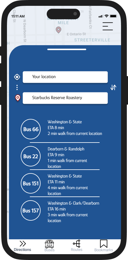
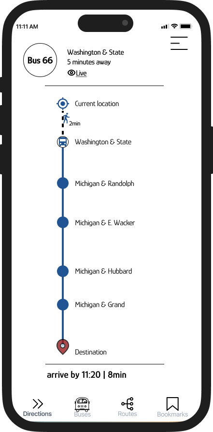
A high fidelity clickable prototype using a live map as the main navigational tool to provide real-time information about bus arrival times at the Washington and State stop.
Audience
Adults, aged 18-44, who utilize the city transit system for school and work commutes.
Product Development Process
1 Research
Market Research
Competitive Analysis
User Interview
Journey Map
User Persona
2 Define
How-Might-We Questions
Product Goals
Target Audience
Site Map
3 Design
Task Flow
User Flow
Wireframes
Branding Responsive UI
UI Kit
4 Prototype & Test
High-Fidelity Prototype
Usability Testing
Research
Research results
Adults, aged 18-44, who utilize the city transit system for school and work commutes.
Research insights
Based on the user surveys and the subjects who were interviewed, I introduce to you, Alex, our persona:
“As a student, I want to clearly see which bus is taking what route since overlapping routes are really confusing, so that I don’t get lost and can get to class on time.”
User stories
“As a tourist, offline saving a route would be nice so that I have access to my route when I don’t have data.”
“As environmentally conscious person, I would like their to be more emphasis on the positive impacts riding a bus makes so that there isn’t a social stigma around taking the bus.”
Overall, using the bus app has positively impacted Alex’s daily commutes, making their routine more predictable, efficient, and less stressful. It has also enhanced their academic and work-related experiences.
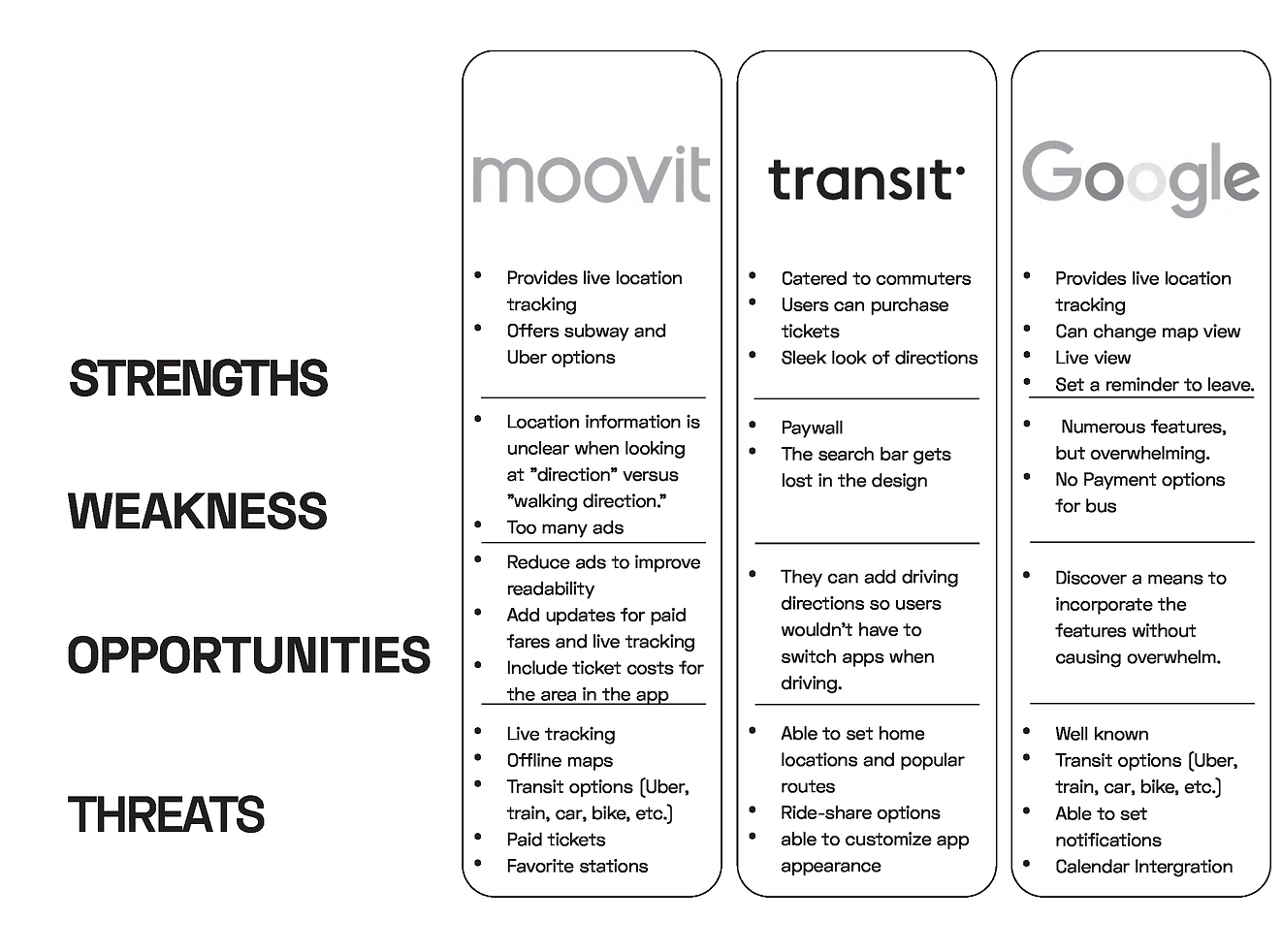
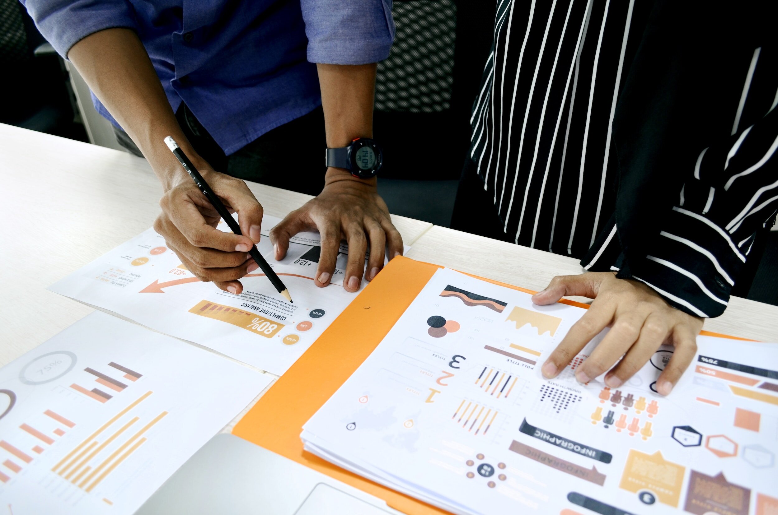
After getting an understanding of our primary user, and before conducting usability tests with relevant potential users of the Scuttle mobile application, I conducted a SWOT analysis of the application and similar products and services our primary users stated they were already using. The SWOT analysis allowed me to evaluate the main competitors and understand their strengths, weaknesses, opportunities, and threats. This gave me a deeper understanding of the market and helped us to make informed decisions about the direction of our project.
We looked at 3 different competitors:
Define
71.5% of respondents were 18-34 years old and living in an urban area.
70% of respondents were students who use bus travel mainly for travel to and from classes
Who is our audience?
Know how much time before a bus arrives at user’s stop
Know what bus lines I can access from a particular stop
Know exactly where a bus is in relation to the user at any given time
Business goals
Offline view of saved routes
Hard to tell what bus is approaching a stop and when the next line will arrive
There needs to be more of an emphasis on the positive environmental narrative around using public transportation
There are too many steps when first using an app
User pain points
How might we…
How might we dedicate the design and feel to emanate a sense of urgency, but not be pushy
How might we seamlessly integrate an emphasis on being environmentally friendly and remove stigma
How might we create a more engaging and personalized experience for users
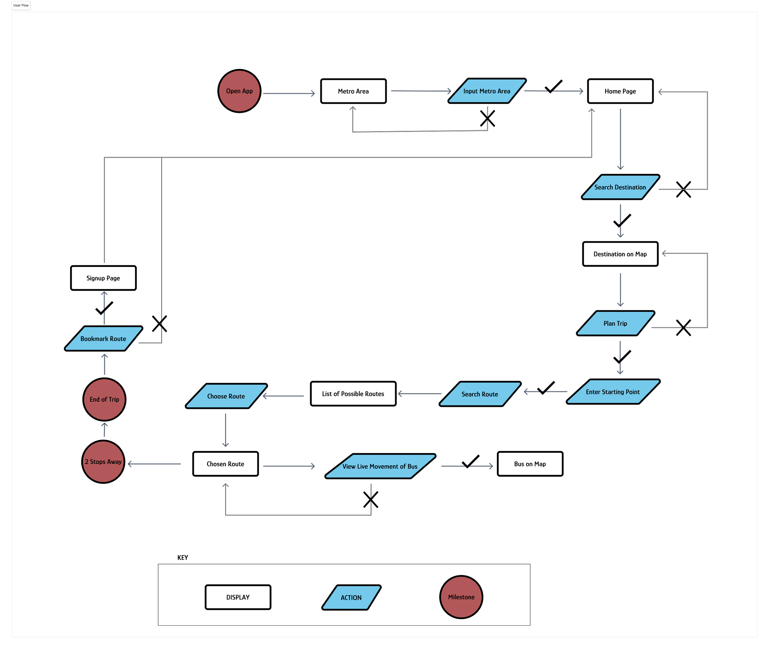
The main user flow
takes users from the landing page straight through to the main app
shows how a user use its find feature to search for their stop and line, in this case, the Washington and State stop with the Red line
shows how a user might save this particular combination of line and stop to their home page for easy viewing which leads to the onboarding page
An application was designed that allows users to view a live map of their current area, search for their bus stop or line, and view a live list of estimated arrivals. The application also allows users to create an account, through which they can save a particular bus stop and line that will populate on their homepage for ease of viewing. After creating an account the user can then start tracking their carbon footprint in comparison to driving their own vehicle.
The solution
Design
Moodboard
UI Kit
I chose the typefaces based on the following criteria:
1. Readability: both “Glory” and “Inter” are known for the legibility, which is helpful in a bus app where users may need to quickly glance at information
2. Versatility: both typefaces come in multiple weights and styles, which contributes to information hierarchy and distinguishes headings, body text, and other design elements
3. Accessibility:
both typefaces offer clear distinctions between characters, which reduce the risk of confusion between visually similar letters or numbers
“Glory” is more stylistic, but still offers clear distinction with letters so it’s great for headings and bigger design elements
“Inter” appear sharp and clear catering to users with different screen resolutions, which is great for small design elements
4. Aesthetic: both have modern and clean aesthetics, which contribute to a simple, yet visually pleasing, contemporary design
Logo process sketches
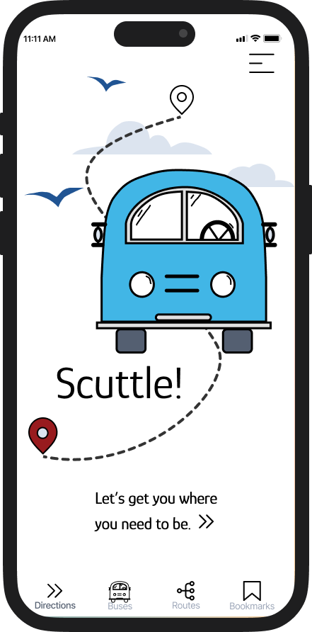
Final logo variations
I cherry picked the colors that represents the city of Chicago to me.
bright blue: represents the stripes of the Chicago flag
trust
serenity
calm
deep red: reminiscent of the hearty amount of sauce in a deep dish pizza
energy
movement
light gray/blue: inspired by The Bean sculpture
While blue may seem like a contradiction to the red in the palette, it balances it, encouraging users to release their anxiety around their commute and trust that they are in good hands and will get to their destination on time.
Prototype & Test
Sketches & Wireframes
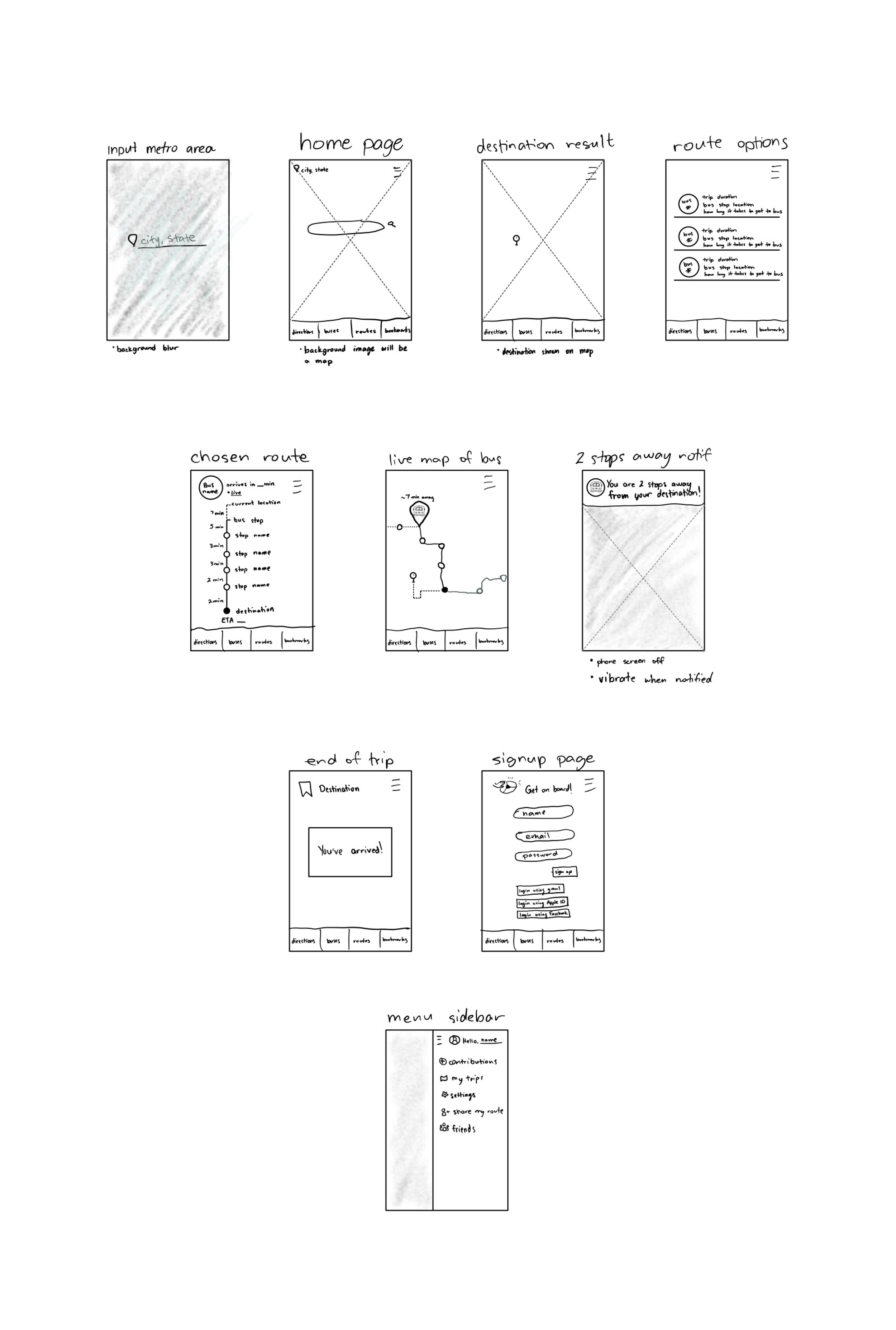
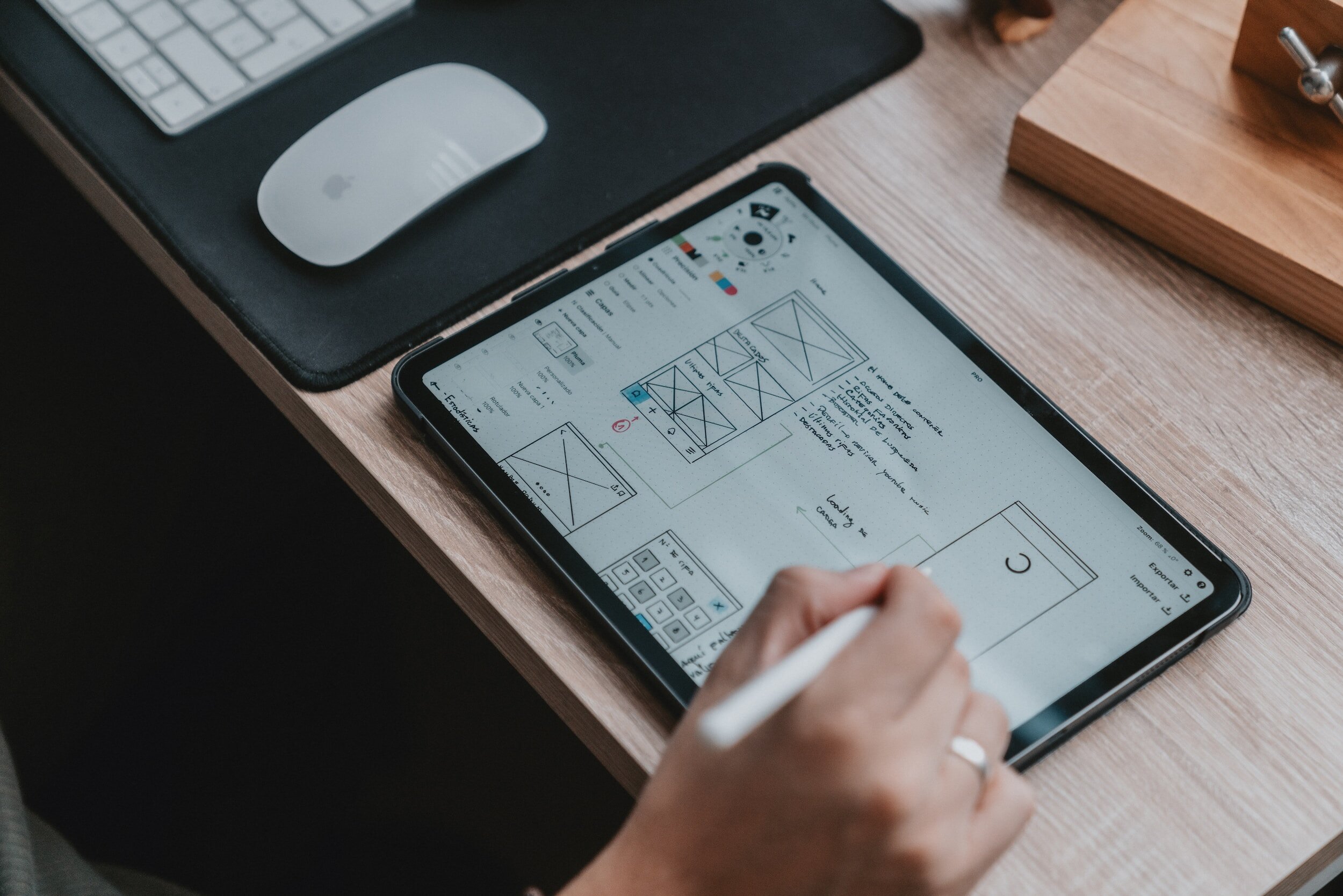
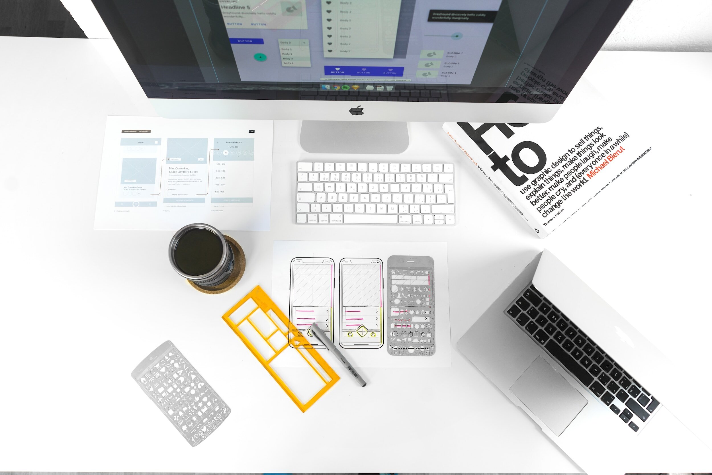
Wireframing played a crucial role in the development of the bus app. It provided a visual representation of the app's layout and flow, allowing us to ensure its usability and accessibility for all users. By creating low-fidelity wireframes, I was able to gather early feedback and make any necessary changes before moving forward with the visual design. This helped to streamline the design process and save valuable time and resources.
Scenario:
You are a college student living and attending school in the Chicago area. You have been taking the city buses to class for a while now, but a new app was just released by the city transit system, and you want to try it out. You catch your bus at the Washington and State stop to grab coffee before heading back to campus.
Usability testing
Tasks:
access the app and search for destination
select the route that will get you to your destination the fastest
find out where you are in relation to the bus stop of the chosen route
track the bus you need to take to get to your destination
save this bus for easy access later
The usability test of the low fidelity prototype showed that the wireframes follow much of the mental map that users have of map based applications and identified a few areas of improvement.
67%
of the users chose the bus route with the bus stop that was closest to them compared to my assumption that they would choose the route with a sooner ETA
What did the user say?
33%
of the users commented that they wish all the icons were clickable because they wanted to explore the app before using it
100%
of the users commented that they like that they were able to use the app right away without needing to input any info
Improvements from the wireframes:
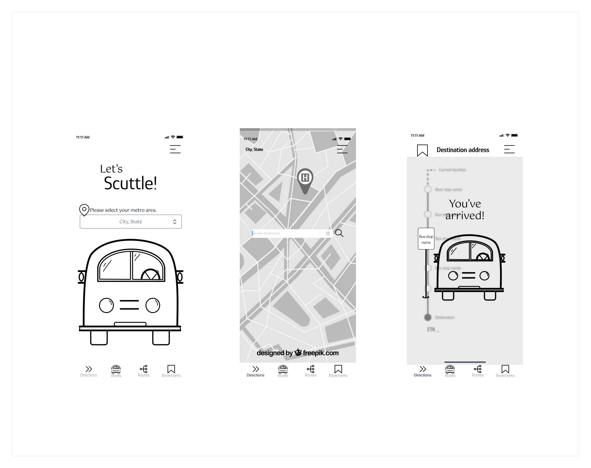
removed the redundancy of inputting a metro area before permission to use current location
clock designed to mimic real time passing
more modern look
more guiding text
High Fidelity Prototype
version 1
Improved app accessibility by adjusting menu bar placement to accurately display the swipe down movement
version 2
version 1
version 2
version 3
Improved small icons by choosing a darker color & adding background, enhancing user experience & accessibility. Added a back button for improved navigation.
Improved map pages by adding a menu button & I added a background to the button to enhance visibility and accessibility.
The final prototype is linked below. This prototype is fully clickable and allows users to follow the main user flow of searching for a destination, checking on the status of their bus line and bus stop, as well as track the specific bus they are hoping to catch. In addition, the user can save that specific bus to their home page for ease of use later.
Final High Fidelity Prototype
Final Thoughts
-
The product successfully met the requirements for the MVP set out by the business requirements.
The prototype allows the user to travel through the main user flow.
Improvements made based on the usability testing improved the overall functionality and accessibility of the prototype to what it is now.
-
limitations of the prototyping software used so the users are unable to mimic the touch navigation and movement of the maps within the prototype, but the frames provided gave enough detail on how to interact with each component
small user demographic for testing, which can be broadened with a little more time and a budget for testing
-
This project highlighted the importance of dedicated user testing and iteration.
Research:
The importance of conducting thorough research to understand the needs, mental maps and preferences of the target audience
Personas:
The value of creating user personas to understand the target user better and tailor the design of the app accordingly
Usability Test:
The need to conduct a usability test to gather feedback on the design and functionality of the app and make necessary refinements to improve user experience


