SpeakEasy:
A Case Study in Mobile Application UX Research and Design.
A language learning platform that focuses on tonal languages starting with Vietnamese. With an emphasis on speaking skills, the app gamifies the learning experience aiming to create a fun and engaging user experience.
Overview
Roles & Responsibilities:
UX Designer —
User Research
Research Analysis
Product Strategy
Brand Development
Interaction Design
Low- and Mid-Fidelity Prototyping
User Testing
Tools: Figma, Google survey/analytics
Duration: 1 month
Team: Danielle Martin, Annie Szarmach
The Challenge
To develop a language learning app that boasts features to learn tonal languages
Primary functions include: access to pronunciation practice and exercises to improve listening comprehension
The Solution
A high fidelity clickable prototype that emphasizes pronunciation practice & enhances listening skills.
Audience
Adults, aged 18-34, who utilize language learning platforms to learn tonal languages
Project Development Process
1 Research
Market Research
Competitive Analysis
User Interview
Journey Map
User Persona
2 Define
MoSCoW Map
Product Goals
Target Audience
3 Design
Task Flow
User Flow
Wireframes
Branding Responsive UI
UI Kit
4 Prototype & Test
High-Fidelity Prototype
Usability Testing
Research
Research results
Adults, aged 18-34, who utilize language learning apps to learn Vietnamese.
Research insights
Based on the user surveys and the subjects who were interviewed, I discovered 3 personas:
Nora represents the casual learner archetype. Casual learners use language learning apps intermittently and at their own pace. They may not have a long term goal but to enjoy exploring new languages.
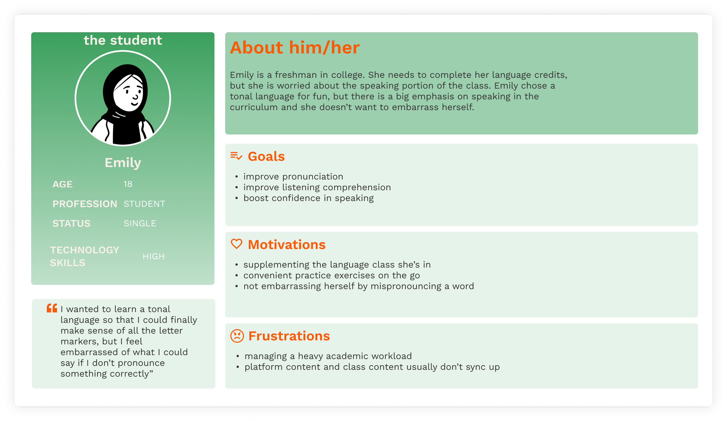
Emily represents the student archetype. Students use language learning platforms to supplement their formal language courses. They appreciate the additional practice, resources and convenience that these platforms offer.
Lia represents the traveler archetype. Travelers use language learning apps to acquire basic conversational skills for trips and vacations. They focus on practical, everyday phrases and vocabulary.
“As a student, I want to be able to practice my pronunciation while on the go since I have a busy schedule and I’d like to use some idle time studying.”
User stories
“As a casual language learner, I want access to the basics of a language, so that I can have a good foundation even though I don’t have a consistent learning schedule.”
“As a traveler, I would like to acquire as many usable phrases and vocabulary as I can for everyday use.”
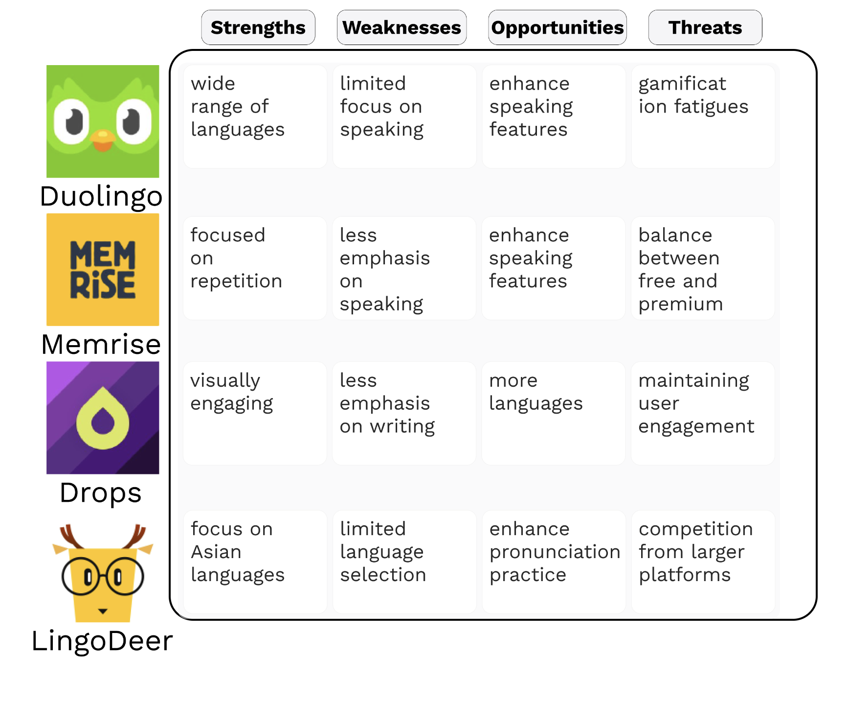
After getting an understanding of our user base, and before conducting usability tests with relevant potential users of the SpeakEasy mobile application, I conducted a S.W.O.T analysis of the applications and similar products and services our user base stated they were already using. The S.W.O.T analysis allowed me to evaluate the main competitors and understand their strengths, weaknesses, opportunities, and threats. This gave me a deeper understanding of the market and helped us to make informed decisions about the direction of our project.
We looked at 4 different competitors:
Competitive analysis

Define
80% of respondents were 18-34 years old
57% of respondents want to learn Vietnamese
more than 30% want to improve their speaking skills
Who is our audience?
Access to pronunciation practice
Access to dictation practice to improve listening skills
Provide useful, everyday vocabulary
Business goals
Finding resources to improve pronunciation skills
Finding resources to learn less commonly taught languages
Adapting to different dialects or accents in the destination country
There are too many steps when first using an app
User pain points
MoSCoW is the acronym for a concept called Must Have/Should Have/Could Have/Would Have. I utilized this conceptual tool to analyze the ranking of language learning platform features and compared them to the insights collected from my user surveys and interviews to determine my product MVP.
MoSCoW map
Must
pronunciation
listening comprehension
Should
vocabulary
useful phrases
Could
reading skills
cultural insights
Would
grammar
community forum
takes users from the landing page straight through to the main app
established the necessary navigation layout for the app
each page noted in these flows was created and tested in wireframes and mockups as detailed in the following sections
The main user flow
A simple application was designed for learning tonal languages starting with Vietnamese. It emphasizes practice on skills needed to have a conversation, like pronunciation practice to improve speaking and dictation exercises to enhance listening comprehensions in addition to having a phrasebook available.
The solution
Design
Brand moodboard
Since this app is about learning Vietnamese, the moodboard consists of many images that I think represent Vietnam. The colors used in the app are pulled from these photos, and the goal was to create a simple app that is reminiscent of the scenery found all over Vietnam.
UI Kit
I chose the typeface based on the following criteria:
1. Readability: appears sharp and clear catering to users with different screen resolutions, which is great for small design elements
2. Versatility: comes in multiple weights and styles, which contributes to information hierarchy and distinguishes headings, body text, and other design elements
3. Accessibility:
offers clear distinctions between characters, which reduce the risk of confusion between visually similar letters or numbers
offers clear distinction with letters so it’s great for headings and bigger design elements
4. Aesthetic: has modern and clean aesthetics, which contribute to a simple, yet visually pleasing, contemporary design
I chose colors that represents the country of Vietnam in my eyes:
orange: represents my favorite Vietnamese food bánh xèo
confidence
enthusiasm
warmth
bright green: reminiscent of the hearty amount of sauce in a deep dish pizza
optimism
growth
red: inspired by the traditional áo dài
passionate
The app invokes positive feelings in order to motivate engage with the app and improve their pronunciation.
Prototype & Test
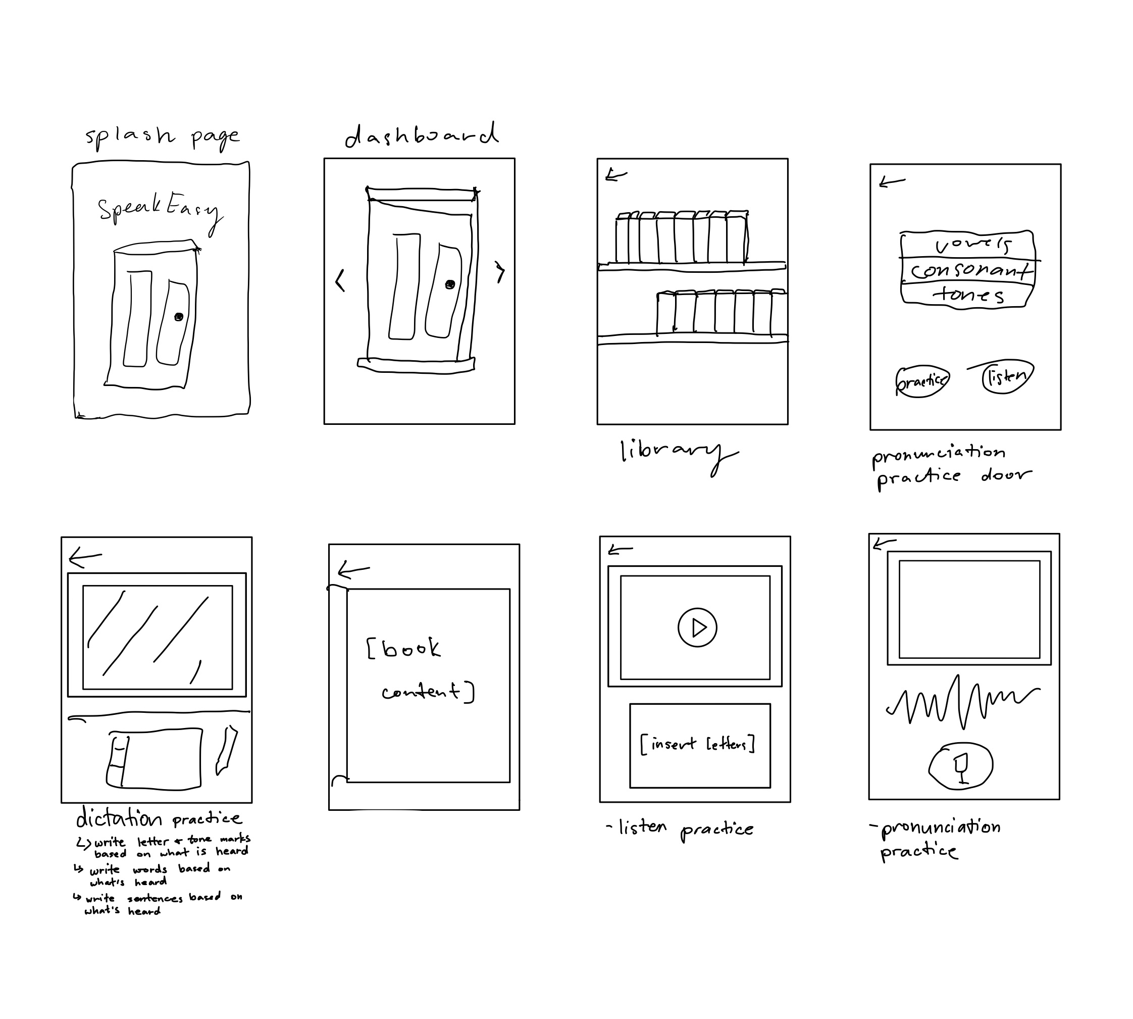
Sketching and wireframing played a crucial role in the development of the language app. It provided a visual representation of the app's layout and flow, allowing me to ensure its usability and accessibility for all users.
Sketches & Wireframes
By creating low-fidelity prototypes, I was able to gather early feedback and make any necessary changes before moving forward with the visual design. This helped to streamline the design process and save valuable time and resources.
Usability testing
Scenario:
You are a sales rep prepping for a trip to Vietnam. You have a month before your trip and have been looking for an app to help you with the language. A new app was just released by the local community college and you want to try it out. You want to start practicing right away to build up your speaking and basic conversational skills.
Tasks:
access the app
start pronunciation practice
enter writing practice door
find the phrasebook
The usability test of the low fidelity prototype showed that the wireframes needed more indicators of what the featured content is per page and verbal guidance. As shown below, there were many areas of the app that needed improvement.
an average of 70%
of the users had a difficult time navigating to the practice pages
What did the user say?
100%
of the users commented that they like that they were able to use the app right away without needing to input any info
100%
of the users commented that they would like there to be more guidance or labels to indicate the contents of a page
Improvements from the wireframes and low fidelity prototype:
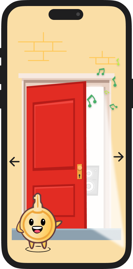
added icons that can be seen through each doorway to represent the content within
added guiding text for each exercise
more details
created a mascot
High Fidelity Prototype
version 1
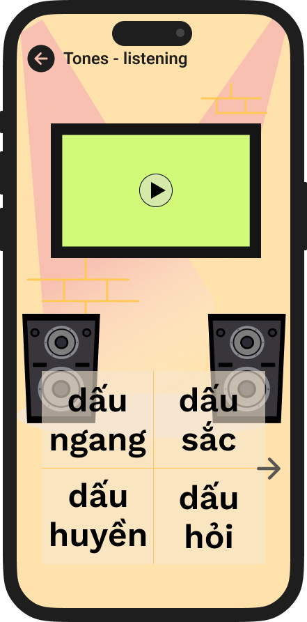
Improved app accessibility by adding elements that can be seen in the doorways to represent featured content
added an app mascot to enhance user engagement
version 2
version 1
Improved app accessibility by adding labels to the back buttons so the user always know what feature they are using
added additional visual elements to increase engagement
version 2
version 1
Improved dictation practice pages by including written guidance and indicators
version 2
The final prototype is linked below. This prototype is fully clickable and allows users to follow the main user flow of improving speaking skills, listening skills, as well as access useful vocabulary.
Final High Fidelity Prototype
Final Thoughts
-
The product successfully met the requirements for the MVP set out by the business requirements.
The prototype allows the user to travel through the main user flow.
Improvements made based on the usability testing improved the overall functionality and accessibility of the prototype to what it is now.
-
graphic design skill limitations made it difficult to create my initial vision
typing in Vietnamese was time consuming
all of these challenges were eventually overcome in order to create the final prototype
-
This project highlighted the importance of defining the MVP and overall scope of a project.
Research:
The importance of conducting thorough research to reveal where your product can fill the gaps of its competitors and understand the needs and mental maps of the target audience
Design:
Developing ways to gamify the learning experience was a fun challenge
Usability Testing & Iteration:
The need to conduct a usability test to gather feedback on the design and functionality of the app and make necessary refinements to improve user experience
-
As a topic I am passionate about, I will continue to develop the mockups and add new functionalities as I continue to learn and grow as a designer.


